Here is a short explainer for my plastics-themed playlist, alas, not compression-moulded from preheated vinyl patty, but rather assembled using digital means (Spotify).
Although there might be other furtile areas to explore, I just wanted to begin by gathering together pop songs which, in different ways, deal with the meaning of plastic.
In almost all of the songs, admittedly prejudiced by where my musical knowledge lies, plastic seems to be used as a metaphor for artifice. However, it is the extent to which artists embrace this artifice where things get interesting.
On the one hand, you have rockers (Captain Beefheart, Frank Zappa, Radiohead), taking their cues from writers like J.D. Salinger and Norman Mailer, deeply concerned with appearing authentic and for whom plastic is associated with phoniness, fakery, and general environmental fears.
On the other, you have the punks/post-punks/poptimists (X-Ray Spex, Kenickie, Ariel Pink) who, in their performances and public personae, posited that pop music was nothing more than artifice and could not transcend its commercial economic structures. The latter tendency is brilliantly personified in someone like Poly Styrene of X-Ray Spex, choosing her nom de plume from the Yellow Pages whilst “looking for … something plastic” and famously singing in ‘Plastic Bag’ (1978): “My mind is like a plastic bag; that corresponds to all those ads; it sucks up all the rubbish.” These artists invoked images of plastics as throwaway in support of a broader, first-person and deeply tongue-in-cheek social critique, not so much ‘damning with faint praise’ as damning with the praise of a knowingly naïve alter ego for whom desire and consumer culture had become inextricably interlinked.
Twitter is most certainly the medium with which to call me out if you think I have missed any obvious plastics cuts and/or you have a different reading of one of the songs than I did.
Volkspark Rehberge – the authors – Photo credit: Peter Dittmann
After a prolonged gestation period, I am happy to announce that Stadien has just gone online. This joint project with Peter Dittmann seeks to document football grounds in Europe. It is inevitably prejudiced by our travels and the fact that we reside in Berlin. It’s all quite loose at the moment, but we are hoping that some themes emerge over time.
We were having some fun with the name. We’re going to be using the latin plural, stadia, but won’t lose sleep over ‘stadiums.’ A stadion, or stade in English, was the square footage of a stadium in Ancient Greece. No longer something malleable, pitch dimensions are now set down by national and international governing bodies.The German plural, Stadien, also means stages or phases. However it’s ultimately articulated, we feel that there might be a sense of measured progress to the constuction of stadia and the events held there.
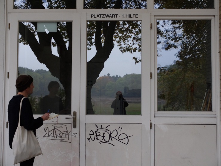
The first post on Stadion Rehberge in Berlin-Wedding went up today. It’s in Afrikansiches Viertel, Wedding’s high Weimar achievement, with buildings by Mies and Taut within walking distance. If Friedrich Hellwig’s clubhouse is, like much of the quarter, made of bricks and mortar, then it’s the artificial materials – the lacquered aluminium ticket booth, the synthetic rubber running track – that most explain contemporary useage. Whether this is a pattern that continues with the other cases remains to be seen.
We’re going to be travelling to other stadia soon. Elsewhere in Berlin, the Poststadion, and the Sportforum in Lichtenberg. Peter has just returned from Chernivtsi in the Ukraine. There is much left to see, document, and explain.
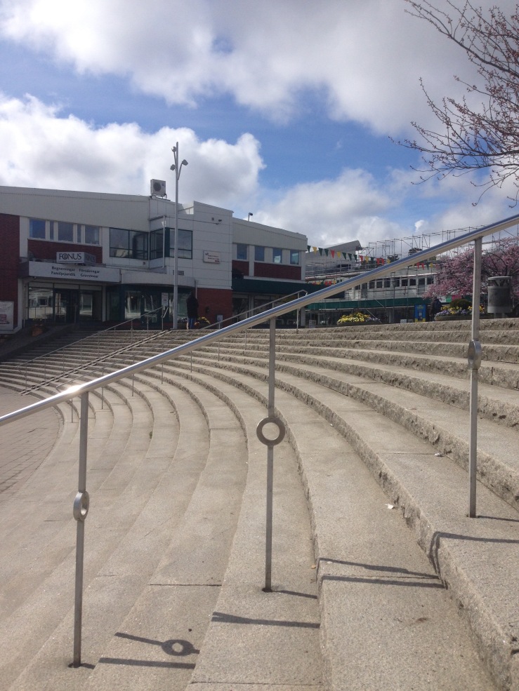
The five concrete oculi are a wink to the audience. They tell us, ‘I am in jest.’
Oculi on W side – Photo credit: Sofia Meyers
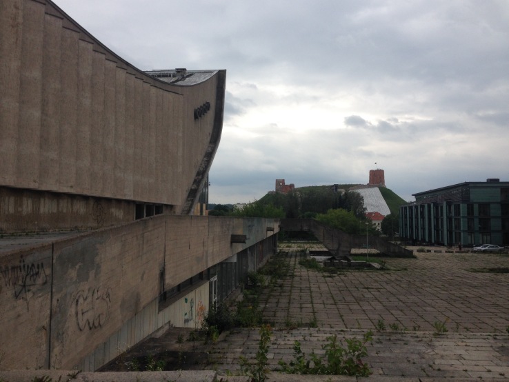
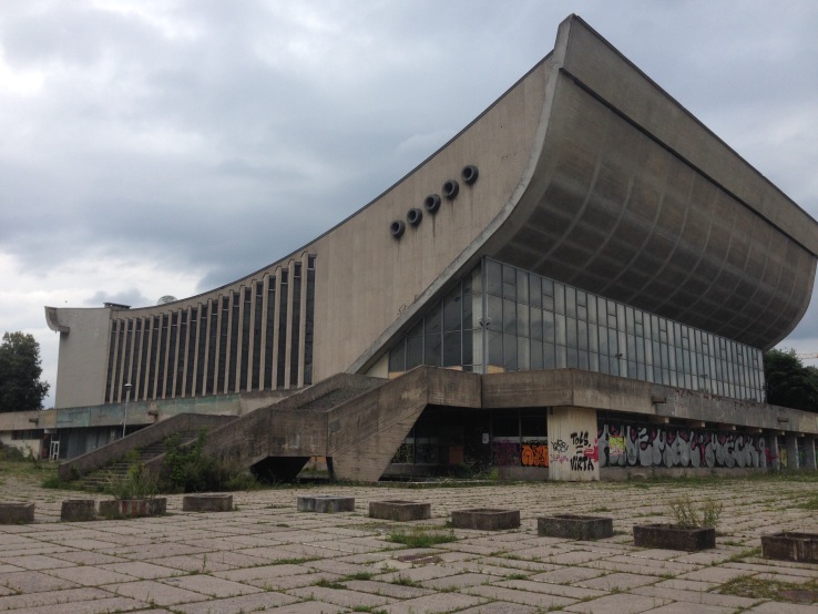
Another Lithuanian city, another guidebook. Julija Reklaite and Ruta Leitanaite jointly edited this one, and we found it in its original Architektūros fondas guise, rather than DOM’s translation. The book encouraged us to venture out of Vilnius’ Old Town and discover this derelict sports hall, planned by Eduardas Chlomauskas, Henrikas Vytautas Karvelis, and Jonas Kriukelis in 1971.
Landscaping on W side – Photo credit: Sofia Meyers
The landscaping on the W side is split over two levels, with an in-situ aggregate concrete walkway above, and a patio of pre-cast slabs below. A single set of stairs bridges the two storeys, articulated variously with 90 and 120 degree angles. The sportshall’s groundplan appears to be an oblong with teeth on the E and W sides.
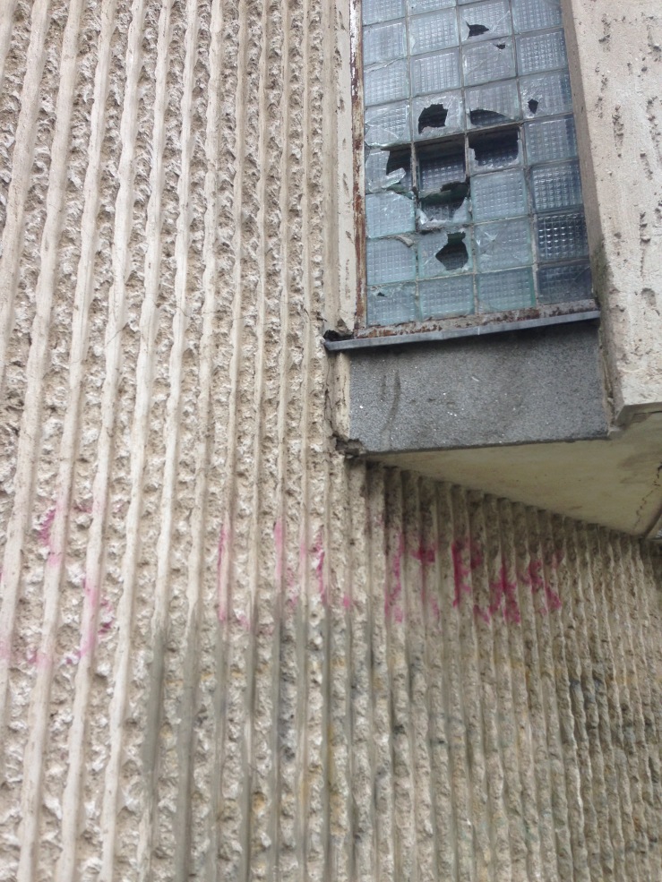
Raised fillets and slat windows on E side – Photo credit: Sofia Meyers
These ‘teeth’ on the E and W sides are a row of overlapping slat windows filled with glass brick. To the left and right of the slat windows are raised fillets, which the builders cast and then returned the next day to enthusiastically rusticate with hammers and chisels. Above, below, and on the south facing vertical bands of the slat windows, the workers gave texture to the still-wet cement, possibly with brushes or rakes. Consequently, both E and W sides have a scratchy, effervescence when viewed from afar. Whilst it has been claimed that the building is a copy of a similar arena in Kiew, there is enough artistry to the concrete work here for Vilnius Sports Hall to be confident of its own significance.
View from SW – Photo credit: Sofia Meyers
On the S face, the crisp glass and steel forms a fine contrast with the concrete swell above. This collision of curves and lines is evocative of a late Picasso or Miro painting. Chlomauskas, Karvelis, and Kriukelis’ work is a further case of the interesting formalism to Lithuania’s architecture in the 1970s and 80s. In its sail construction and light playful detailing, Vilnius Sports Hall may bear comparison with the Arka Pana church in Kraków.
Post Office and Zoological Mueseum – Photo credit: Sofia Meyers
Walking down Laisvės Alėja, or Liberty Avenue, our next morning began by visiting the building most used to illustrate Kaunas’ interwar architecture. The Post Office building is most likely the defacto choice because it is in decent condition and has a pure, vertical symmetry, and so most conforms to our expectations of the Modern Movement. However, as we have seen in yesterday’s post, balance is not always a given here. Kaunas’s buildings are more varied than that and deserve to be enjoyed as a diverse whole. No blanket term or single image does it all justice.
Next door, the Zoological Museum is more regularly planned but stoically doing good work. The large vertical slabs of precast aggregate concrete and the lower section of glass and steel give it the impression of safety film passing through a projector. It would make a fine cinema.
Spurginé is lighter on discussions of style, but heavier on fried dough. A bit further along Laisvės Alėja, its all plywood panelling, counters in the round, and pointing at the menu. The red-wedge, decorative vinyl murals also suggest that Rodchenko may have had an undocumented mature phase designing mass, interior furnishings for Lithuanian doughnut joints. Those who prefer not covering their clients with powdered sugar are best served visiting the wall-mounted handwashing station before leaving and returning to work.
Resurrection Church – Corpus on E wall – Photo credit: Sofia Meyers
Up the funicular, the Resurrection Church is indeed curious. With its riveted portal and square-profiled buttresses, it has the same planar variety as the surrounding interwar housing. However, the scale and the materials here would have made it unfeasible at that time, but not unimagined. The columns, bevelled and lathed, contribute to the building’s industrial classicism. It is not the Basilica in Vilnius which offers a comparable experience, but being inside Peter Behren’s Turbinenhalle in Gesundbrunnen. The depiction of Christ hanging on the E wall here is one step towards naturalism from Ernst Barlach’s in Charlottenburg or Graham Sutherland’s in Coventry. It is both corporeal and expressive.
Picture Gallery – Foyer – Photo credit: Sofia Meyers
The Kauno paveikslu galerija, or Kaunas Picture Gallery, has both bulk and fragility. It was just a few steps away from Funkas’ apartment building that we had seen the day before. The Gallery was an excellent opportunity to savour the formalism of Kaunas’ State Socialist architecture from the 1970s. A large, semi-enclosed front terrace gives way to hipped square-profiled columns and load-bearing walls. These form the external framework for the facades, the materials homogenous when viewed from afar, but revealing, at closer quarters, cut, rusticated stone, reinforced concrete, and cement over red brick. The foyer has a plywood ticket office. The barstaff are caring and know which beer is unfiltered.
Departing the New Town by bus, the outline of Silainiai’s panel buildings, and other more formalist examples in the outer suburbs highlighted in the guidebook, make clear that there is more to be discovered on future visits. Their vast scale is commensurate with Kaunas’ built achievements, laid out with assiduousness by Julija Reklaitė and the other contributors.
The interwar buildings of Kaunas have come under the spotlight recently. They were awarded UNESCO status this year, and two exhibition were held on the subject in Berlin, organised jointly by the Lithuanian Embassy and DOM Verlag. This coincided with the release of DOM’s German translation of Julija Reklaitė’s architectural guide to Lithuania’s second city.
It was a great pleasure to be able to spend two days exploring the city and putting Reklaitė’s book to the test. The guide is organised by period and includes the full gamut from 1919 onwards, including contemporary works, and does well to avoid a moralising tone when discussing the built remnants of State Socialism.
We were informed in the introduction that the neighbourhood in which we were staying, Naujamiestis, or New Town, was laid out following Peter Marius Fransen and Antanas Jokimas’s town plan of 1923. The origins of the scheme were said to lie in Kaunas’ becoming the seat of government in 1919, and the opening of a university in the city in 1922. The technical faculty of the college fostered a generation of architects, Lithuanians like Feliksas Vizbaras and Stasys Kudokas, along with graduates from Germany, France, and Russia in the 1930s. A real international scene flourished.
One such German graduate was Arnas Funkas. One of his earliest works on K. Donelaičio gatvę was our first port of call. The guidebook informed us that it was designed prior to receiving his architect’s licence and so it was necessary for his father-in-law to sign off on the plans.
Arnas Funkas apartment building – N facade – Photo credit: Sofia Meyers
The sheer number of window types alone make clear that this was the work of a young architect. There were band windows around corners, long windows on the S side with wrought iron sunbeam coverings, and portcullises blown up to two metres high. Milesian restraint this wasn’t.
Whilst surveying the exterior a scene arose familiar to many building spotters, but it played out in unexpected fashion. We were rather conspicuous outside, my notebook being quite large and my partner busying herself with the camera. A moustached man smoking a hand-rolled cigarette appeared at the portcullis window. Noticing that we were architecture tourists, he beckoned us across to the large door frame. He introduced himself as Robertas and took the time to give us a tour of the building.
Ascending via the circular steel staircase to the SW corner of the building, we were deposited on the first floor. The E wall was decked with a wooden arch, overlain with a trellis and culminating in two, slim, tapered columns. The round windows were immense. A single pane of glass, 2 metres in diameter with bolts at the top and bottom to form a central axis. Robertas showed us the NW room too, where the front page of Lietuvos ūkininkas, a Lithuanian daily from 1904, had been used on the brick wall as insulation.
Portcullis window in NE room of first storey – Photo credit: Sofia Meyers
As we made our way up to the rooftop, we noted with apprehension that brand new pitched rafters had been placed over the original flat roof. However, Robertas assuaged our fears and told us that the flat roof would be retained. This framework was to be covered in tarpaulin and used as a shelter whilst the construction work was being undertaken. It proved to be so when we walked past again the next day. The ventilation duct on the roof, like much of the exterior, was streamlined with brick and cement.
Brick and cement streamlining on roof – Photo credit: Sofia Meyers
With its sunbeam window coverings, and curved steel staircase with a wooden handrail, and tapered wooden columns, there was a mounting sense of Henri van de Velde to Funkas’ apartment building. Indeed, the early Bauhaus may be the most direct comparison to the feel of this house. Understandably, Reklaitė and the other contributors have sought to emphasise the most modern of materials for this most modern of architectures, particularly the use of reinforced concrete. However, what might be more interesting, is that, if there was a will to modern form, it was in this case composed of brick, iron, wood, and turn-of-the-century newspapers. It is beyond my abilities to describe precisely how, but more educated people in this regard may also note in the forthcoming examples a quite different understanding of proportion, more akin to fragile, elongated Jugendstil.
As he matured, Funkas was to increasingly learn the values of restraint. He went on to build many more houses in Kaunas, most notably a second apartment on the same street. He was evidently satisfied enough with the building to keep an office there until it was knocked down in 1940. For Reklaitė, this marked the end point of High Modernism and the beginning of the Soviet years.
More of Kaunas’ pre- and postwar buildings will appear in Part II of this post.
Interlopers at a birthday party, their questions were legitimate but constant.
‘What are you planning to do then here in Bonn?’
I answered after a long pause. ‘Well, I do want to see the Kanzlerbungalow.’
English garrulousness ensured that was not the end of my utterance.
‘You know,’ I started, ‘I find it very interesting. Washington D.C. has the White House, Downing Street is about right for our ambitions, but the chancellor’s residence was a bungalow in Bonn.’
One of my interrogators laughed. The other two were understandably more defensive.
‘It was, you know, very chic,’ said one.
‘I’m not even sure it was called a bungalow,’ said the other.
A quick google on her part confirmed its status as a bungalow and, more worryingly, my status as the worst kind of Berliner Arschloch imaginable.
Our search for the Kanzlerbungalow began one day later with a short jolt across the Rhine from Bonn-Beuel to Bonn-Südstadt. Across the water, a red brick church with an immense choir was flanked by the new humanist, distinctly Scandinavian, Hotel Königshof to the right, and a stepped mid-70s mini-ziggurat to the left with precast concrete terraces. Battling against the strong, northerly current of the river, our small ship’s forward passage revealed the delightful 50s waterfront Rheinpavillion. Having reached the relative safety of the other side, the strip window of the university library to the South marked the beginning of our excursion into Bonn’s still fresh representative past.
Never before in Western Europe had the mechanisms of statecraft displayed this level of modesty. Supposedly, Adenauer chose Bonn as he had a country house in the suburbs. The lack of prior state grandeur was viewed as a distinct positive. The first Bundeshaus was not even purpose built. Originally erected in 1930, it was converted into the parliament building in 1946. This marked the beginning of an ensemble of political buildings falling between the Rhine, Adenauer Allee, and, more latterly, the United Nations Campus. It is, for many, architecture which is not-quite-there, an effect multiplied by accumulation.
Planungsgruppe Stieldorf’s federal chancellery building
The bungalow was designed by Sep Ruf and opened in 1964. It was based on Mies van der Rohe’s Barcelona Pavilion of 1929.[1] Managed by the Haus der Geschichte, the bungalow was closed when we went there, and our attempts to ascertain whether it actually exists were impeded by the fact that it now resides on land belonging to The Federal Ministry for Economic Affairs and Energy. The ministry took occupancy of another fragment of Bonn’s past in 2006: the federal chancellery building. Planungsgruppe Stieldorf won the competition to design a showpiece office complex for the chancellor and, upon completion in 1976, it was criticised for being too anonymous and corporate. Yes, that polished glass and aluminium cladding do give it a colour palette familiar to many financial buildings in London and Frankfurt. Yet, its anonymity, a complimentary characteristic to many a high-tech architect, was certainly in the spirit of the unassuming precedent set thirty years earlier.
Further down the river, Egon Eiermann’s Langer Eugen (1966-69), on the south-east side of a pinchpoint on the Rhine, creates wonderful geometry. It is perpendicular to the water, but the landscape inscribes the lower arc of a circle onto the arrangement. The geometry has been disturbed somewhat in the intervening years by the ellipses ground plan of the newer DHL building. Eiermann worked together with Krup on the Brussels World Exhibition of 1958, Langer Eugen’s service stairwell abstracted from the main body of the building gives it a similar profile to Goldfinger’s Trellick Tower. However, with the drama turned down to 1 here, we are left only with the harmony of practical thinking.
The ensemble concluded with us taking the underground from Gronau Heusallee/Museumsmeile. The U-Bahn stations had been a constant delight in Köln-Bonn and this one was no different. Orange was employed for plastic seating, green for plasticised metal handrails, and yellow for the walls and ceiling, the latter beginning as ceramic tile and ending as aluminium cladding. The whole effect was magnified by the deep black of the platform wall and overhead space. Thus, the view across the tracks in any station creates a coarse, thickly-applied, dollopy horizontal stripe on a jet black canvas. A certain amount of fun can be had positioning oneself at the front of the train, looking through the semi-transparent glass ahead, as the next station comes rushing towards you.
Köln frames the past, the Westdeutscher Rundfunk building and Cologne Cathedral
Bonn is forever linked with Köln, not least in public transport. Our time there was briefer, but didactic. Whether due to its advanced position in the arts, or its relative prosperity the centre certainly felt like architecture for architects. Everywhere one looked, one saw buildings coming to terms with the sublime masonry of the gothic past with the application of industrial but appropriate C20 materials. Whether on this ordinary building adjoining the historic town hall, or the muted, greys, greens, and blacks on Bischofsgartenstraße, or the hulking Westdeutscher Rundfunk building, the precast or on-site concrete and metalwork formed a rich engagement with Köln’s gothic past. Be it in Köln, Bonn, or Charlottenburg, it was precisely this lack of desire to conform to building lines and historic street pattern orientation which placed a setsquare over the older stuff and demanded that we see it differently. Egon Eiermann’s Gedächtniskirche on Kürfustendamm is exemplary, but it was evidently happening in the west too. There has been research on West Germany’s own townscape moment in recent years, and the more one experiences postwar town centres there, the more obvious this becomes.[2]
Precast concrete detailing on the Westdeutscher Rundfunk building
[1] Ingmar Kurth and Markus Frenzl, Kanzlerbungalow, Trademark Publishing presents Picnic 2 (Frankfurt am Main: Trademark Publishing, 2009).
[2] Jasper Cepl, “Townscape in Germany,” The Journal of Architecture 17, no. 5 (October 2012): 777–90, doi:10.1080/13602365.2012.724859.
Adrian Forty has, in recent years, set the tone for cultural analyses of physical materials. His points of opposition, concrete’s dual status as modern-unmodern, historical-ahistorical, natural-artificial, and local-universal, were in this class applied to plastic and wood. After engaging with his ideas theoretically, and deciding that a new category of transitory-permeant might here be required, students were asked to get out onto the street, the campus, their Kiez, and photograph uses of plastic, wood, and concrete.
Expanding Forty’s central thesis, #MetaphysicsOfMaterials was created on the mass observation archive more commonly known as Instagram. The students’ photos ranged from plastic pseudo-terracotta roof tiles, to Ost Moderne, in both precast concrete panel (Tina, Hendrik, Solveig) and in-situ, planarly-intersecting concrete and steel forms (Nathalie, Tina, Luca, Lukasz). Generally, the most beloved materials appeared to be those with the imprint of human activity, e.g. concrete cast in-situ into wooden planks or footprints in the still wet cement (Nathalie), or those impregnated with John Ruskin or Alois Riegl’s notion of Age Value. Crumbling concrete blocks come to be seen eventually as evocative of the coarse bark of a mature tree (Solveig). Nature reclaiming a wooden shed probably built once by an ardent hobbyist (Jan). All kinds of aged concrete paving stones and wooden gates (Tim, Pia). The least beloved were attempts by plastic to mimic ceramic, as with the roof tiles (Denise), or wood, as with brown PVC windows on Plattenbauten that might deserve better (Solveig). If art and architecture is the conscious application of skill and wit to materials at hand, then it is nothing but artificial, and all the better for it.
The Metaphysics of Materials is an ongoing project with my AFG students at Hochschule Anhalt. If you would like to add your photos to the project, upload them to Instagram with the hashtag, #METAPHYSICSOFMATERIALS.
This was my third visit to Gothenburg. Each time I was there, something different has drawn my attention. The first time, it was the classically-informed functionalism of Götaplatsen and Gunnar Asplund’s extention to the Law Courts. On my second visit, in spite of spending a long time seeking out Peter Celsing’s Härlanda kyrka, it was actually the churches of the national romantic movement which had the greatest effect on me, along with the art nouveau apartment and university buildings in Vasastan.[1] Most recently, I was staying in a suburban housing estate, Kortedala, the majority of which was built by the Gothenburg Town Planning Office from 1953 onwards.[2] It was a good lesson in how the buildings at the edge of a city can reprise and subvert the idioms of the centre.
Kortedala is the kind of thing Sweden was famously good at. It had a centre which could have come straight out of the CIAM Heart of the City conference of 1951, a trend Colin Rowe witheringly referred to as “simulat[ing] the qualities of the solid centre with elements of the void.” [3] You can see what he was getting at, there is something occasionally flimsy and transient about this air of festival or exhibition made permanent. Yet, this would be to put the cart before the horse, as it was this kind of thing which inspired the Festival of Britain. The mere fact that it’s still here some sixty years after construction is testament to more long term thinking and solidity of humanity, if not always robust detailing. Unsurprisingly, the central square was surrounded by a public library, rows of shops, and a ‘Forum,’ classical precedent something of a necessity in the postwar revival of centres. It also featured a primitivist, public sculpture, and lightly decorative railings. Between the library and the forum, a neat concrete bridge with angled supports connected the square to an area of economic production, before tumbling down to the tram station below. Surrounding this public space, were three-storey row apartment buildings in repeating horseshoe clusters. These had been in-filled in the 1960s with nine storey, square planned blocks, dramatically staged on Gothenburg’s rocky outcrops, and best viewed from below.[4] In its widening, expansive transport and road network draped elegantly over craggy cliffs, Pittsburgh, PA may owe it some debt. Other waterbound cities, e.g. Istanbul, face similar challenges.
In terms of façade work, on the nine-floor blocks, bare rust-coloured bricks give way to sandwich panels and oxidised-copper upright mansard roofs. On the low rise, row apartment buildings, plastic is trusted to do certain jobs, i.e. the guttering (PVC?). New Humanism was sometimes a shorthand for lightly decorated, populist geometry, and the housing at Kortedala is no exception. It was the newer materials which give it its air of festivity, its humanity: corrugated plastic sheeting for balconies on the row apartments, sandwich panels on the tower blocks, aluminium cladding on the shops. It’s all bannisters and flagpoles and organised fun. However, lurking beneath this miniature gaiety, on the row apartment buildings at least, are the yellow, rusticated brick, known locally as Gothenburg Brick. It becomes as familiar as London Stock, and anything built in it becomes immediately bound with Gothenburg’s entire, post-Hanseatic League architectural history, from the muted Baroque Christinae Kyrka (1748), Götaplatsen (1926-34), to Nils Einar Eriksson’s Folkets Hus (1948-56), and everything in between. The Gothenburg Brick is not necessarily structural here, there is concrete and steel for that. Therefore, to invert Rowe’s statement, it is rather “articulating the void with elements of solid [masonary].” The surface layer of new material charm is given suddenly existential, nordic depths.
Footnotes
[1] I now realise this is something of a false dicotomy. Sigfrid Ericson, the architect of the Masthuggskyrkan (1914), the most spectacularly sited national romantic church, went on to design the classicist Konstmuseum at Götaplatsen (1923). David Watkin, A History of Western Architecture (Laurence King Publishing, 2005), 616.
[2] George Everard Kidder Smith, The New Architecture of Europe: An Illustrated Guidebook and Appraisal (World Publishing Company, 1961), 229.
[3] Colin Rowe and Fred Koetter, “The Crisis of the Object: The Predicament of Texture,” in Collage City (London and Cambridge, MA: The MIT Press, 1978), 62.
[4] Of the piecemeal information on Kortedala available online, the listing on the New Town Institute seems to be the best. It references architects who were involved in its construction. Sven Brorild and Jan Wallinder’s tower blocks with triangular ground plans were also published in “das Wohnen” in 1965. See: “INTI – International New Town Institute,” accessed April 27, 2016, http://www.newtowninstitute.org/newtowndata/newtown.php?newtownId=1076; Maurer, Adolf, “Vom Wohnungsbau in Schweden,” Das Wohnen 40, no. 8 (1965): 265, doi:10.5169/seals-103618.
“It’s all jazz and inverted commas. They must have ‘known,’ right? They must have been ‘in?’ Or have a lifetime of Haus-Rücker-Co and J.G. Ballard made us see it this way? The psychosexual world of AtomAge Magazine, kink and boots and PVC, appears here to have been built into industry films themselves, even as early as 1962. And what does it mean to fetishise the products of industry? It means that we are witnessing the production of desire. This is no objet (a), often we only begin craving when something is in reach. The statement at the end: “infinite shapes and infinite functions.” Infinitude of form is apparent in this ludic, pink, plastic playpark, but function is no longer evident in the objects. It is rather loaded onto us in the form of an imperative. And a playpark requires signage, doesn’t it? Go here, do this, don’t do that. At the end of the film each consumer good becomes, in that most traditionally sixties way, a sign of itself. An outward projection of an inwardly-residing imperative to enjoy. Just how much were the filmmakers conscious of all this?”
These questions guided an article I am currently writing about Pendry’s work from 1962. As the pieces have come together, the wonder of the incomprehensible has gradually been sublimated by knowing and rationalising, and suddenly the above paragraph feels wholly out of place in the text. The sublime is ever the victim of context. A context which is, broadly, that the film was produced by the circle around the Shell Film Unit and British Transport Films, but commissioned by The British Plastics Federation. And yes, the filmmakers were ‘in’ to some extent. Geoffrey Jones’ Snow is a good entry point to this type of thing if you haven’t seen it before. There has been much research on industrial films by Patrick Russell, Patrick Vonderau and Vinzenz Hediger. The article will hopefully contribute to this field, and allow me to approach the topic of plastics from a quite different angle. Dissipating feelings of synthetic awe, notwithstanding.
The Troisdorfer Kunststoffhaus by Reinhold Frenz for Dynamit-Nobel AG on the Neue Deutsche Wochenschau show in 1962. In an article for Kunstoffe two years earlier, Frenz said that German architects were inspired by the Monsanto House of the Future in Disneyland, California to build their own all-plastic home in Troisdorf in 1959. According to Frenz, the building’s volume was 94% plastic. Much of the remaining 6% must have been the steel frame, but even that was surrounded with Mipolam elastic. Tronex polyester corrugated sheets were also used on the roof.[1]
[1] Reinhold Frenz, “Ein Kunststoff-Haus Im Bungalow-Stil,” Kunststoffe, 1960, 360–65.


